Diagnostics module redesign
10 min read
Overview
The task
To connect a new customer, field engineers check available switch ports remotely in the app. The switch sits in a utility room at the address. The engineer needs to find out which port is available for the apartment on the work order — and what state it is in.
Product
Mobile app for handling work orders
Users
Field engineers — specialists who visit customers at home to connect internet and TV: run the cable, set up the equipment or replace it.
District network engineers — specialists who handle line failures, for example when an entire building loses internet.
How we'll know it worked
- Number of actions in the connection scenario: we count the actions spent before and after. Today: 6 steps
- Average time users spend in the section: taken from analytics, compared month over month. Today: 16.25 min
User story
As a field engineer, I want to see only the information I need to find the right customer port, so that I can complete the work order
Result
Results
- Actions in the connection scenario: 6 → 3 steps (−50%)
- Average time in the section: 16 min 25 sec → 8 min 48 sec (−46%)
Source: product analytics, month-over-month comparison.
Screens before
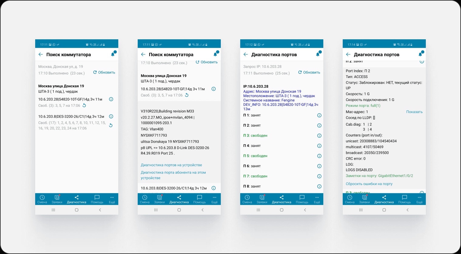
- Incorrect port information on the switch
- Out-of-date information on the switch screen
- Slow switch polling
- Extra steps to run the diagnostics
- You have to check every port until you find the right one
- Out-of-date information on the port screen
Screens after
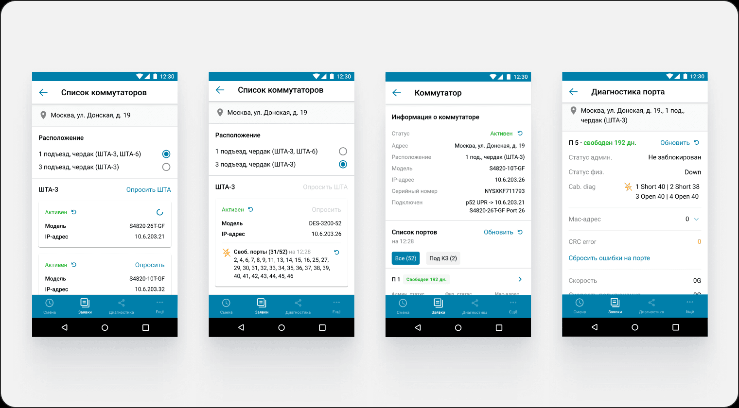
- Removed the incorrect port display shown before the switch is polled
- Grouped the data by entity
- Added the ability to poll several switches at once
- Added a switch status
- Added a polled state for the switch
- Moved secondary information to the next step
- A polled switch with a short-circuited port is marked with a lightning icon
- Grouped the data by switch
- Surfaced the key port information immediately
- Added sorting for short-circuited ports
- Added a status with the number of days
- Added an information hierarchy
- Ordered the data by importance and sequence
- Removed the out-of-date data
- Split the information into blocks
- Added the location of the switch the port belongs to
Problem
Business problem
- Fewer completed work orders
- Client NPS drops because of no-shows and late arrivals by field engineers
User problem
- Risk of refusing or rescheduling the next work order
- Too many unnecessary actions to run diagnostics
- The order of steps is not intuitive
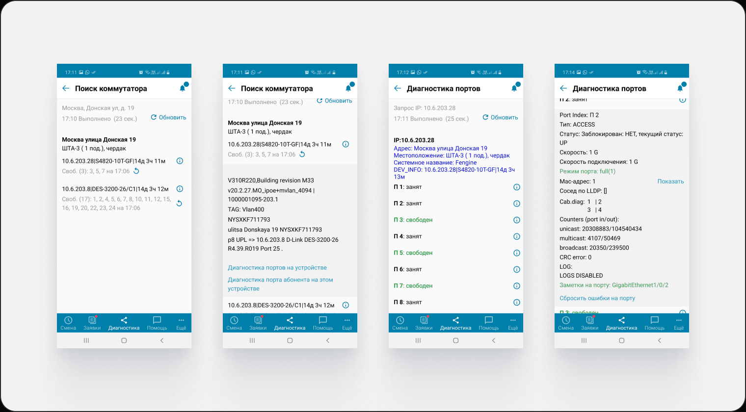

At the start we had an overloaded diagnostics section, with outdated and missing data on the screens. Plus artefacts from the designer who had worked on the task before me: a screen flow and interviews covering the problems.
Even so, I built the process around field visits and semi-structured problem interviews, using the existing artefacts as a starting point for the first hypotheses.
Process
Research
- Stakeholder map
- Field research
- Semi-structured problem interviews
- Competitors
Analysis
- Interview analysis
- User flow
- Sitemap
Design
- Building the screens
- Building the prototype
Usability testing
- Writing the guide
- Report
- Follow-up plan
Handoff to development
- Presenting the work to the team and the developers
Research
Stakeholder map
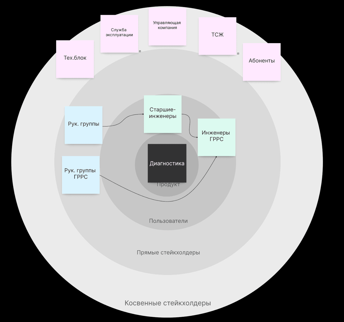
What it gave
Alongside field engineers there is a second, non-target user type — district network engineers, who were also worth talking to.
Field research
Goal
- Get inside the context of a field engineer's work
- Understand how diagnostics and port lookup actually happen in the field
What I did
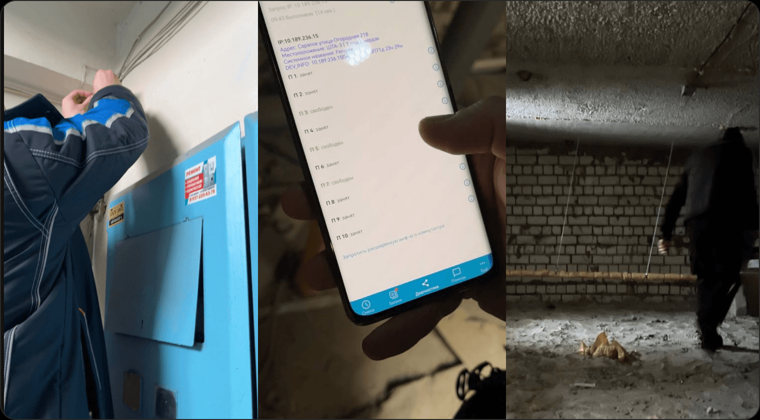
Spent a day with a field engineer, joining him on work orders and watching how he uses the app in real conditions.
What it gave
A much clearer picture of the user's working context, what he needs, and the problems he runs into on site.
To work out which port a cable is plugged into, the engineer physically shorts the cable and checks in the app which port responds — that tells him whether it works.
The video shows how the engineer has to open every port one by one and check its parameters.
Semi-structured problem interviews
Goal
- Establish which information matters to field engineers and district network engineers
- Establish which interface elements get used and which don't
- Find out what needs to change to make the work easier
Respondents
With low user turnover and no resource for recruiting, the sample size was limited.
Who: field engineers (FE) and district network engineers (DNE)
Count: 4 people
Split by experience
- 2 field engineers: 3 and 3.6 years, mid-level
- 1 field engineer: 15+ years, senior
- 1 district network engineer: 15+ years, senior
Expected outcome
- Hypotheses confirmed or disproved
- Interface recommendations based on the collected data
Hypotheses
- FEs don't use all the data on a connection work order
- The inactive-customer search doesn't match reality
- FEs need the serial number to identify a switch
- Port information matters to FEs in the switch list
- FEs don't use the request time and duration
- FEs don't use all of the switch information
- FEs need detailed port information up front
- FEs need TKD information shown the same way on the ports screen and the switches screen
- FEs don't use all of the port-level information
Analysis
Hypotheses, findings, decisions
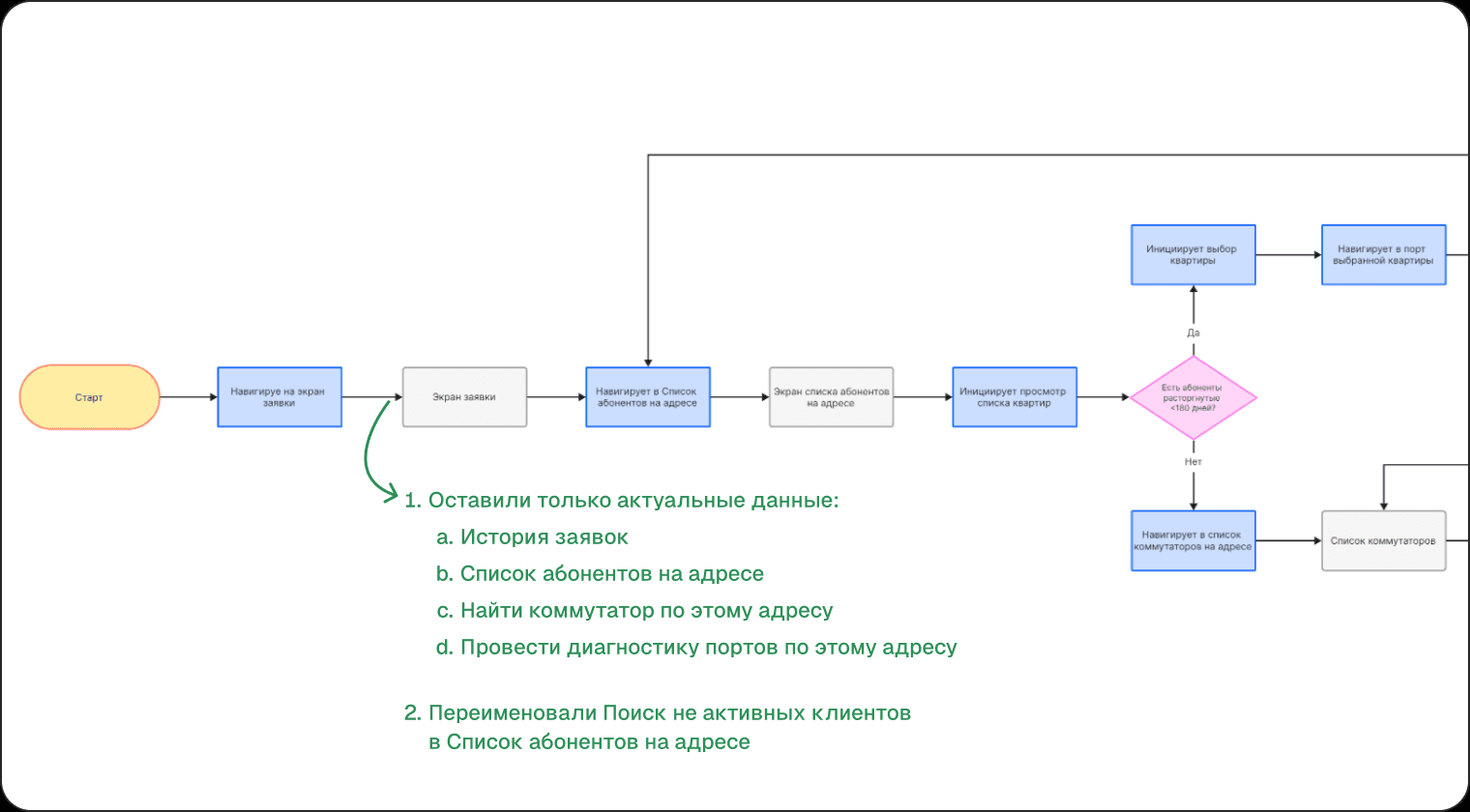
FEs don't use all the data on a connection work order
→ Keep only the data that is actually used:
- Work order history
- Customers at this address
- Find a switch at this address
- Run port diagnostics for this address
The "Inactive customer search" button doesn't match reality
→ Rename Inactive customer search
to Customers at this address
FEs need the serial number to identify a switch*
The serial number is needed by district network engineers to write off or identify a switch, and only rarely by field engineers.
→ Move the serial number line into the switch block
Port information matters to FEs in the switch list
Port data is displayed incorrectly for older device types, so the switch has to be polled again.
→ Show port information when the switch is polled
FEs don't use the request time and duration
Request duration is not relevant for respondents.
→ Remove:
- request duration
- TKD uptime
FEs don't use all of the switch information
→ Keep only the relevant information:
- serial number
- upstream switch details
FEs need detailed port information up front, without opening each port
Respondents wanted all the information visible at once, without expanding every port.
→ Show port information immediately
FEs need TKD information shown the same way on the ports screen and the switches screen
→ Remove the duplicated IP address
→ Remove TKD uptime
→ Keep: IP, address, TKD location, model
FEs don't use all of the port-level information
Not every respondent knows what each label means, and they don't use them at work.
→ Give every parameter a name
→ Put the information in order
Although district network engineers use the diagnostics section rarely and in a limited way, when replacing a switch it matters to them that they can identify it in the app by serial number. Before moving to design, the findings and possible solutions were discussed with the team and prioritised.
User flow
Sitemap
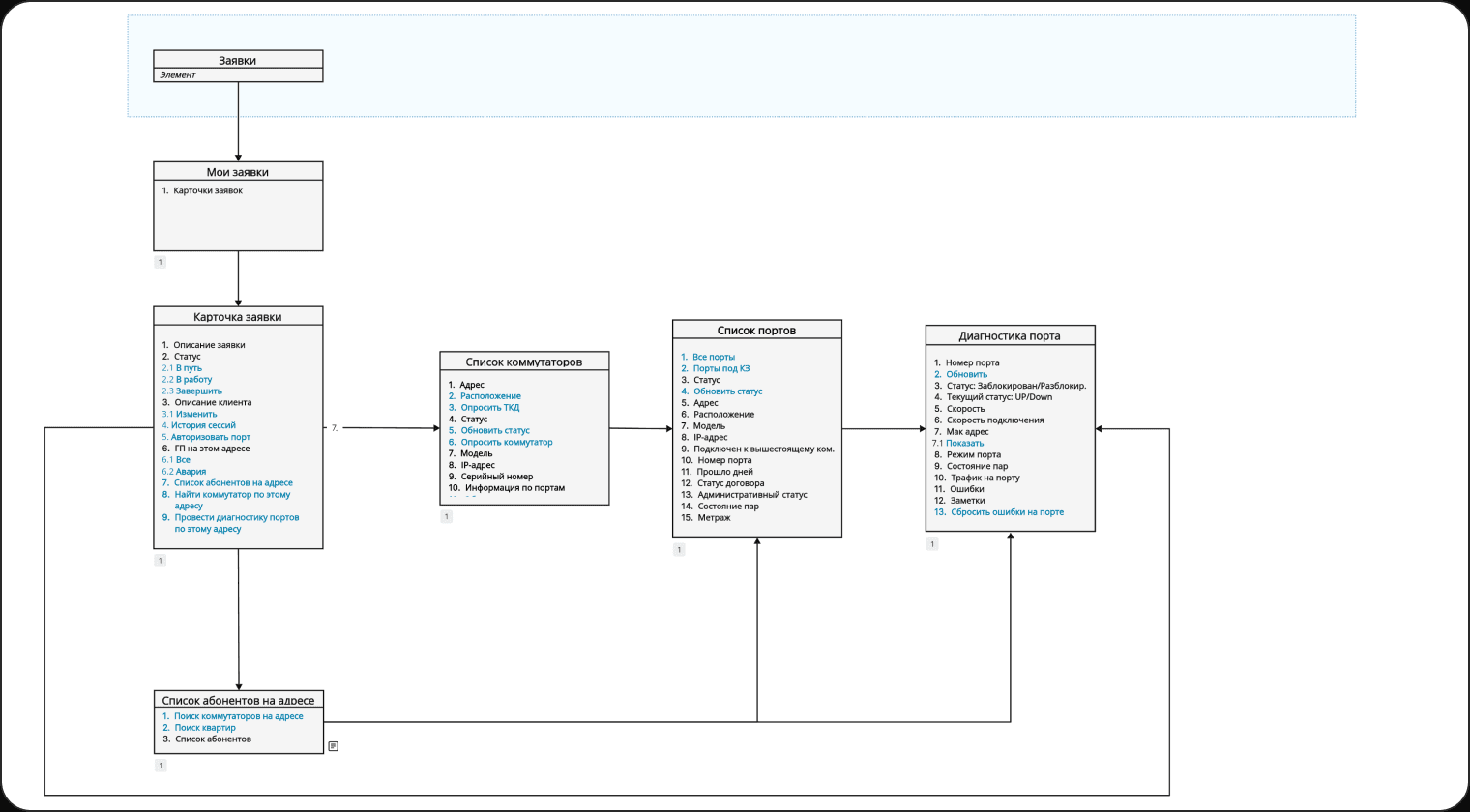
Mapped the structure and the links between screens. Teal marks the data the user interacts with
Usability testing
Iteration 1
Goal
Find out:
- How clear it is to the user how to interact with a switch
- Whether the user can spot a short-circuited port while searching for it
- Whether the proposed solution has problems of its own
Respondents
Who: field engineers
Count: 8 people
Split by experience
- 6 field engineers: 6+ months
- 2 field engineers: < 6 months
Hypotheses
- The user can refresh the switch status
- The user can poll a single switch from the full ShTA list
- When looking for a port, the user picks the right switch location
- When looking for a port, the user picks a switch
- After polling, the user understands that the switch has been polled
- The user can spot a short-circuited port
- The user can find the port
Task
You've received a work order to connect a customer. At the address, between floors, you found a cable nobody is using and now you need to check it. Find the port the cable is plugged into and confirm that it works.
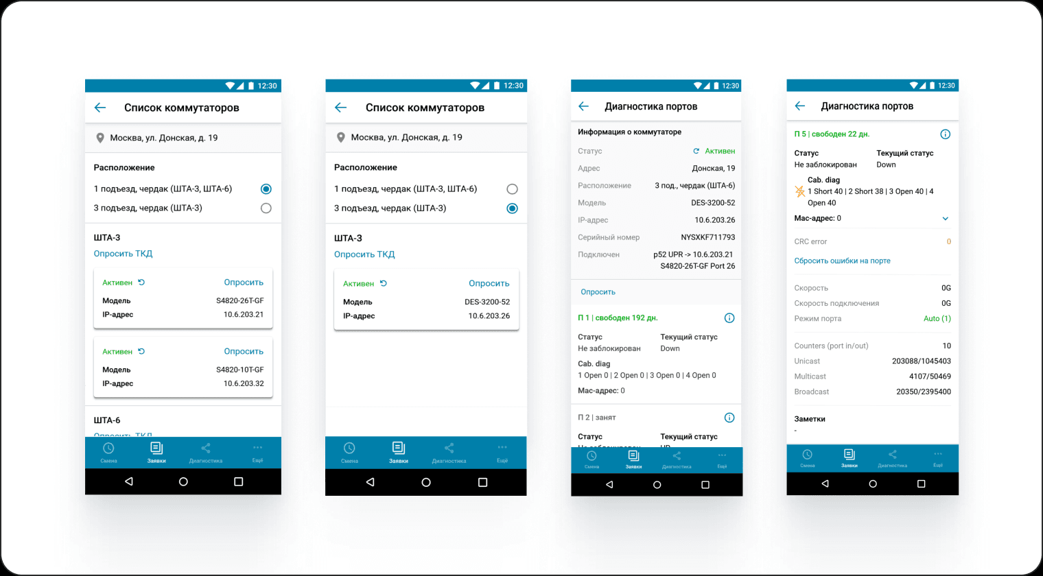
Key takeaways
Every hypothesis was confirmed, but there were insights:
- Some users didn't realise the switch card was tappable
- Some users didn't realise the switch had been polled after polling it
- Some users didn't read the lightning icon as meaning the port is short-circuited
- Some users noted that they couldn't refresh ports on the switch screen or the port screen
Decision
- A hint screen on first entry into the section
- Add data on polling: state, the fact that a switch can't be polled twice, and a changed state for the poll button
- Add the ability to refresh ports
Iteration 2
Key takeaways
- Users said that scrolling to find a port is awkward and takes time.
- Some users noted that the city is missing on the switch screen, which matters when searching for a specific port
Decision
- Add sorting to the port list to find the right port
- Add the missing switch details
- Rename the "Poll TKD" button to "Poll ShTA", since it is the ShTA that gets polled
Outcome
Results
- Actions in the connection scenario: 6 → 3 steps (−50%)
- Average time in the section: 16 min 25 sec → 8 min 48 sec (−46%)
Source: product analytics, month-over-month comparison.
Work order screen
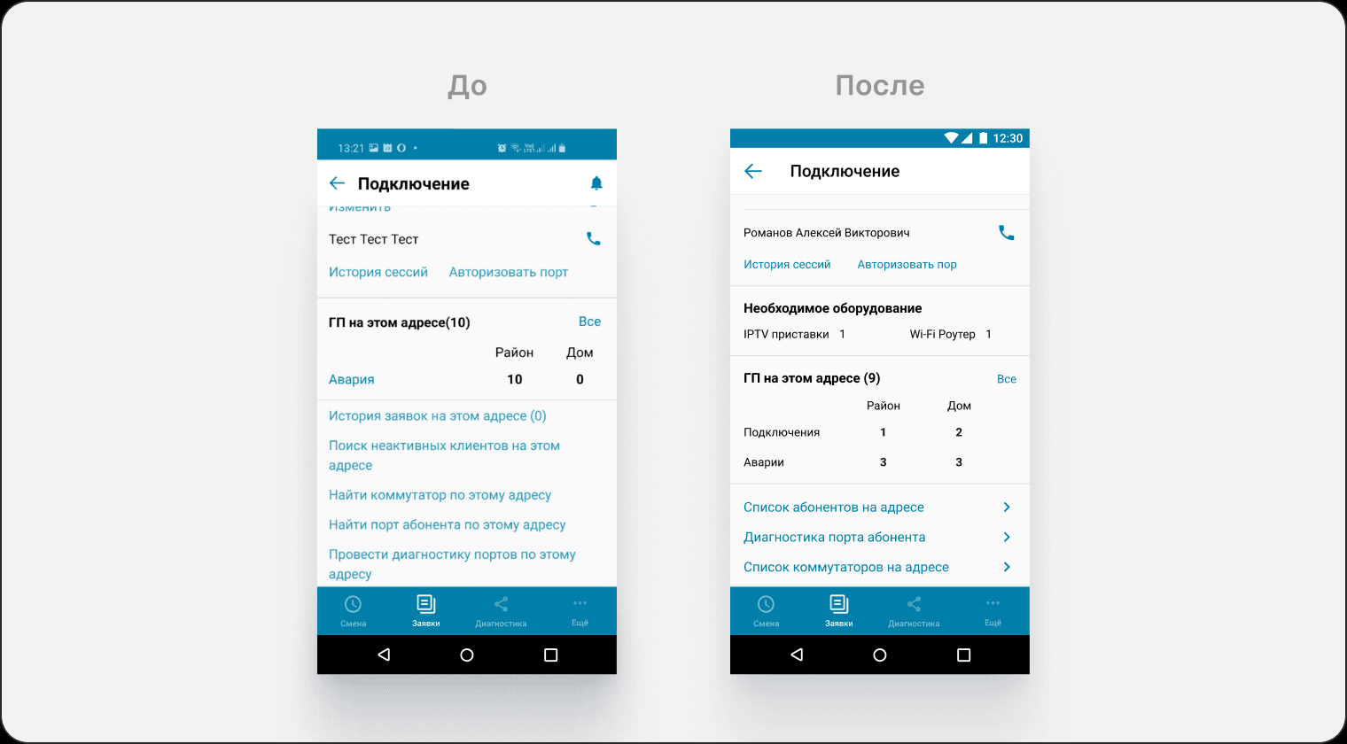
- Kept only the relevant data and renamed the section
Switch list
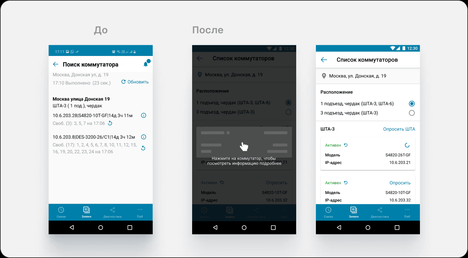
- Removed the incorrect port display shown before the switch is polled
- Grouped the data by entity
- Added the ability to poll several switches at once
- Added a switch status
Switch after polling
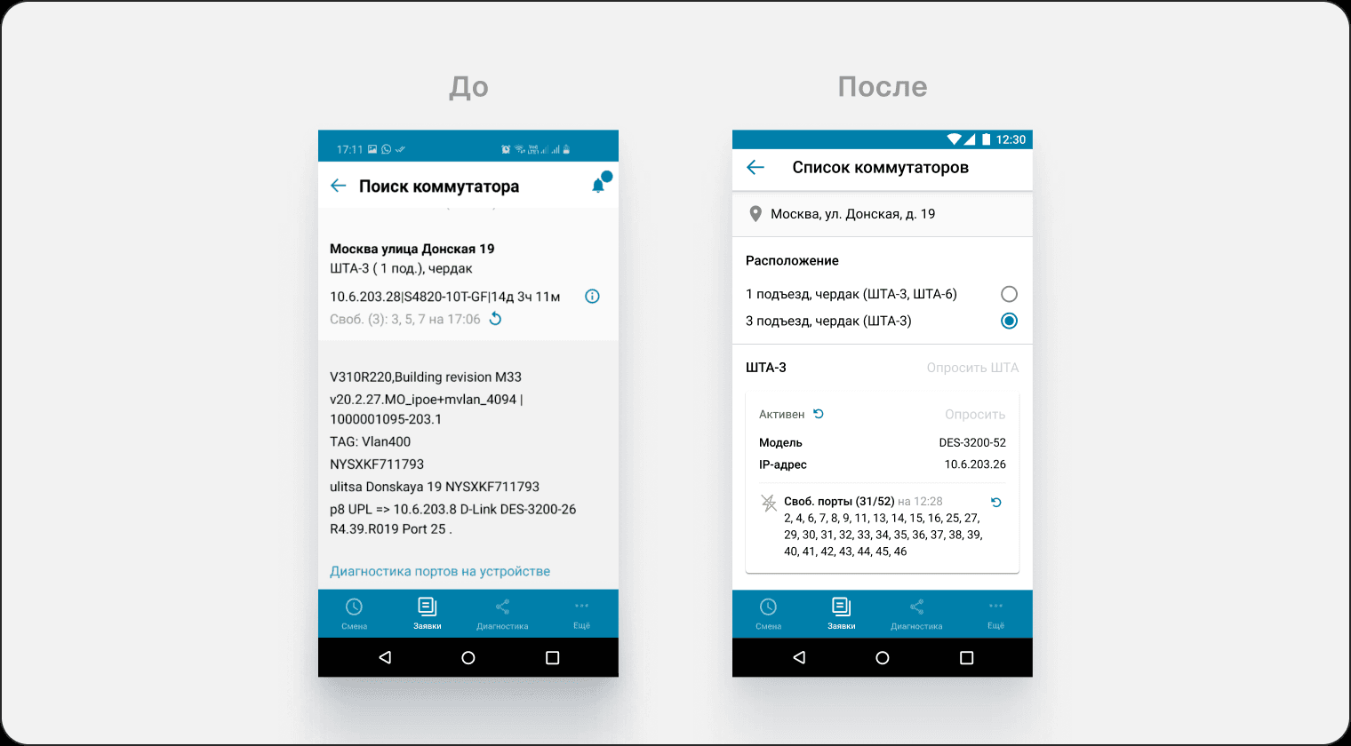
- Added a polled state for the switch
- Moved secondary information to the next step
- A polled switch with a short-circuited port is marked with a lightning icon
Switch screen
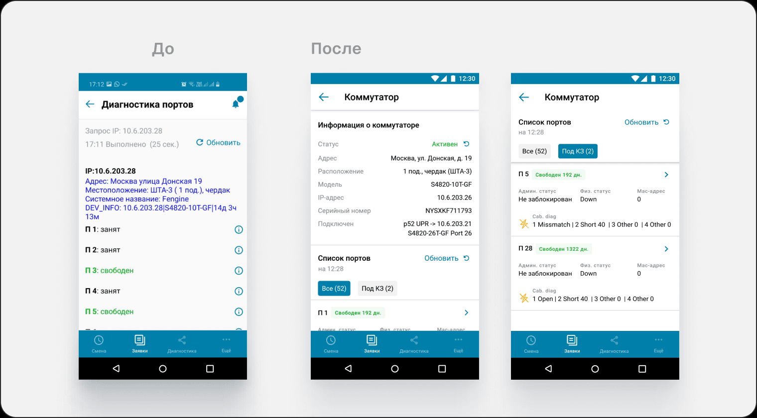
- Grouped the data by switch
- Surfaced the key port information immediately
- Added sorting for short-circuited ports
- Added a status with the number of days
Port screen
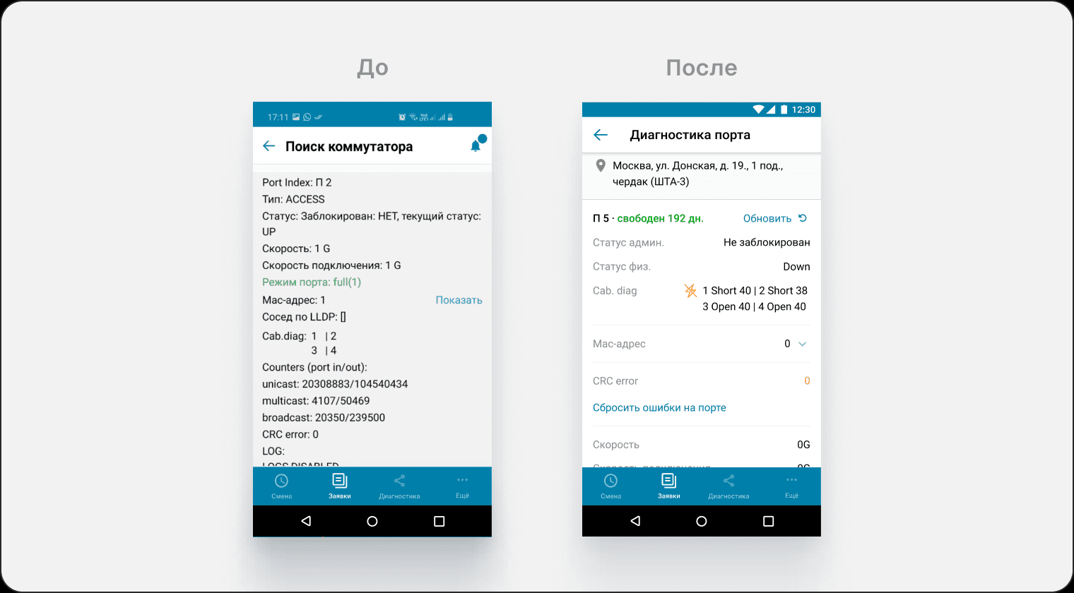
- Added an information hierarchy
- Ordered the data by importance and sequence
- Removed the out-of-date data
- Split the information into blocks
- Added the location of the switch the port belongs to
Challenges and how I solved them
Shallow understanding of the domain
Challenge: This was one of my first large tasks on the product, and my understanding of it was shallow.
Solution: I went into the field to understand the working context and what makes it specific for our users.
What I learned: I got much better at reading the user's working context, what they actually need, and the problems they hit in real conditions.
Understanding the target audience
Challenge: The brief named a single target role — the field engineer. I took that at face value and designed for them. It turned out they weren't the only ones using diagnostics.
Solution: I put together a stakeholder map and spotted a second role in the landscape — district network engineers. They weren't part of the target audience, but there were cases where they work with this section. I brought them into the research and worked through the specifics of their job: when replacing a switch, they check the serial number in the app against the one on the switch itself.
A field engineer doesn't need the serial number in their scenario, so I moved it out of the switch list, where it was redundant, and into the switch block: the main scenario stays uncluttered, and the district network engineer finds the data when they need it.
What I learned: Not to limit research to the users named in the brief. A stakeholder map shows the whole picture of users from a bird's-eye view.
No competing solutions
Challenge: There were no direct equivalents publicly available on the market.
Solution: I collected old vendor-app screens from experienced users and took the good decisions from them. I also reconstructed a screen flow for a field engineer app from a design studio case study.
What I learned: I got better at finding references in a limited information space.